Brian Rieger, a designer at design and development firm Yiibu, has put together a great presentation on rethinking the mobile web, covering the current and future prospects for adaptave, accessible web development for desktop and mobile. The presentation by itself is great, but is even better when coupled directly with Yiibu’s main website. They’ve turned their site into a living example of the ideals and considerations that the presentation lays out, including adaptive css and media queries.

Be sure to flip through the presentation, and then take a read of the full design concepts and background of the site.
- Rethinking the Mobile Web Presentation
- Yiibu Homepage (Demonstrating great flexible design)
- How the Yiibu site was built
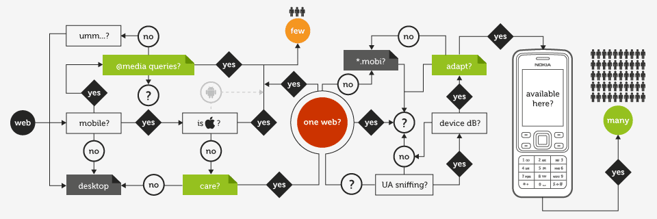
- Main article on Rethinking the Mobile Web, by Bryan Rieger
The approach
The site is designed using (what is rapidly becoming known as) the ‘mobile first’ principle. Also incorporated are elements of responsive design.The base content and default presentation are mobile, and optimized for the very simplest devices first. We’ve defined this as ‘basic’ support.
Devices with small screens and media query support are served an enhanced layout—and occasionally—more complex content. We’ve called this ‘mobile’.
Finally, the layout and content are enhanced to reflect the ‘desktop’ context.
On the first visit, the server checks for a ‘properties’ cookie containing specific browser ‘feature support’ results (obtained from tests carried out by a little bit of JavaScript). Devices that don’t supply a ‘properties’ cookie, or have JavaScript disabled are always served the basic version of the site.