Panel – Time Traveling: Interfaces for Geotemporal Visualization moderated by Adam Rabinowitz, Asst ProfessorUniversity of Texas

Summary:
Displaying geography alone is easy: interactive maps are more and more a part of our everyday lives. Displaying time alone is easy: we are all familiar with charts and animations that show the passage of time. It is increasingly common to display time and space together in a single visual interface as well, but this combination has raised a number of new questions. There are few conventions or standards for geotemporal visualization, and we are still discovering which approaches are most effective for which datasets. Focusing particularly on historical data, this panel will explore issues in the modeling and visualization of geotemporal information, presenting existing approaches and discussing new trends.
Notes:
- Presentation Materials
- Resources
- How do we tell the stories that are going on now?
- Nicholas Rabinowitz –
- Data visualization uses visual elements to represent data
- Two uses of data visualization – Presentation and Analysis
- Good data visualization means making tradoffs between presentation and analysis
- Time being represented as a line on the map, with text labels. Magellian’s route visualized, but with only a simple line defining his route, the users can’t see any time-related data.
- Time as map data – points on a map of date of incorporation of new england downs – hard to take two towns and compare data of founding
- Small multiples – lots of little maps of date of incorporation of new england downs.
- Animation – very logical, map time to time. great for presentations
- Linked map & time representations – explorers plotted as points on google map
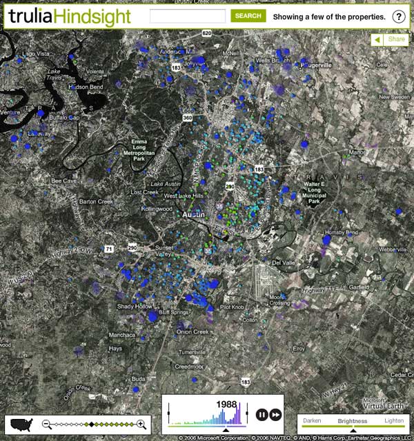
- A lot of well fleshed out visualizations combine multiple visualization methots – example – Trulia Hindsight
- Nicholas’ full presentation (link coming soon)
- Ana Boa-Ventura – Co-Founder – media shots
- “Emotions are the blue that causes history to stick”
- Trust and reputation – where does this problem arise in geotemporal visualization?
- Honestly.com – one way to verify identity, in order to build online trust
- Tao of Journalism seal – transparent accountable open
- Netflix (?) – put an award out to anybody who could improve recommendation systems.
- Ryan Shaw – Asst ProfessorUniversity of North Carolina at Chapel Hill
- Visualizations are constrained by the data we have. If we want richer visualizations, we need richer data
- Events, and not dates, are what have the most significance for visualizations over time
- What should a data model for events look like?
- Wikipedia thinks it’s a box – wikipeda block of text, and picture. Boring. We can do better
- Better to think of events as a block, like a falling tetris block, and can fit in to the overall picture. But unlike a tetris block, events don’t have a natural state. Shapes of events change as stories change. We can understand this better if we make analogy with time and space.
- Stories are analogies to an itinerary through space
- Examples – https://www.flickr.com/photos/walkingsf/4671581511/
- Example – Neighborhoods project – https://hood.theory.org
- Irene Ros – Visualization Research DeveloperIBM Research
- What are we excluding when we have such great access to visualization tools?
- Egyptian Revolution is a great example
- Trendsmap – visualization of the egypt hash tag


