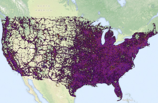
 Fresh from Buzzfeed, via Animal New York and Bucky Turko, here’s an interactive map of auto accidents – scary to see how many they are, and where they tend to crop up. Stay safe on the roads for the upcoming holiday season!
Fresh from Buzzfeed, via Animal New York and Bucky Turko, here’s an interactive map of auto accidents – scary to see how many they are, and where they tend to crop up. Stay safe on the roads for the upcoming holiday season!